Wednesday, 23 April 2014

Final Ancillary Task 2


Ancillary Task 2 


I have already posted images of the site, but this is a more clear, concise edition. 


This is the "Home" page of the website I created.


This is the "News" page of the website I created.


Final Draft Front Page

Updated


I have reacted to my lectures feedback. I was told to get rid of some of the text in the flag, to make the jump lines bold, add my tag line, add an image in the main story, make the text flow and read easier - that was actually said by most.


Final Page 2

Page 2


I have two stories on this page, one is a feature story. I have followed multiple conventions, such as the block lettering, the page number and date at the top of the page etc (see evaluation).


Thursday, 3 April 2014

Final Ancillary 1

Billboard


I've been told to make my billboard more simplistic, so here it is. I took the masthead, slogan, QR code, bar with publisher, and social media ads, these where taken from the previous billboards, the website and the main product (newspaper).

Prior to this I'd was planning on writing up a radio convocation, however this was the tasking option plus the radio ancillary wasn't in my assignment brief.


Wednesday, 12 March 2014

Evaluation Question 3

Audience Feedback


Demographic:
My target audience of my product is the socio economic code C2, D, and E. Anything from construction workers, to admin/office workers, to students, unemployed and retired citizens. Generally the working glass, who will red the paper in the breaks, or at home.


Audience Profiling:
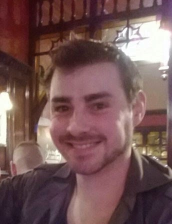


Keith Hall:
Age: 30
Lifestyle: Smoker
Occupation: Engineer (C2)
Beliefs: N/A
Music Tastes: 90's Dance
Film tastes: Game of Thrones, Robo-Cop, Universal Soldier


William Teasdale:
Age: 30
Lifestyle: Smoker
Occupation: Forklift Driver (C2)
Beliefs: N/A
Music Tastes: Current Top 40
Film tastes: The Fast and the Furious (1-6)


These where used in the images, but also fit the audience profile:
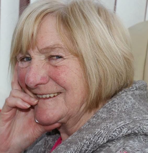


Mary Teasdale:
Age: 66
Lifestyle: Smoker
Occupation: Retired (E)
Beliefs: Christian
Music tastes: The Beatles
Film tastes: Psycho, Breakfast at Tiffany's, Corrination Street.
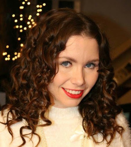


Carrie Hall:
Age: 27
Lifestyle: Student
Occupation: Unemployed (E)
Beliefs: Christian
Music tastes: Current Top 40
Film tastes: Twilight, The Hunger Games, New Girl.
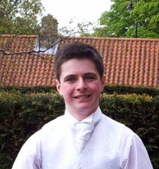


Dominic Brady (me):
Age: 17
Lifestyle: Student
Occupation: Unemployed (E)
Beliefs: N/A
Music tastes: Stone Sour, Seether, Metallica
Film tastes: The God Father, Donnie Brasco, Fearing and Loathing in Las Vegas.


Survey:
Those above where asked (bar myself) where asked the following questions:

What genre are my products?
Keith answered: "A tabloid."
William answered: "A tabloid."
Mary answered: "A tabloid."
Carrie answered: "A tabloid."

What makes you think this?

Keith answered: "The layout."
William answered: "The way its all set out."
Mary answered: "The red top, its like The Sun."
Carrie answered: "The layout, and logo."


How have I met the expectations of the genre?

Keith answered: "The over the top stories."
William answered: "The colour used."
Mary answered: "The red top."
Carrie answered: "The stories, and the colour."


Does it appeal to you?

Keith answered: "No."
William answered:"Not really."
Mary answered: "Yes."
Carrie answered: "No."


Why?

Keith answered: "I use the internet."
William answered: "I'd rather watch the news."
Mary answered: "I like to read the morning paper."
Carrie answered: "I'd use the internet."

From the target audience, it only appeals to one person, and she is of an older generation, that tend to find difficulty using technology and are set in their ways and routines. This shows that my product is outdated and a dying craft. 


Friday, 14 February 2014

Evaluation Question 2

How effective is the combination of the main product and
ancillary tasks?


My products are the two pages of a newspaper, a billboard, and a website. each one of my products work together due to the fact that they have the same font, the same tag line, the organisations are all the same, my images are all interlinked.


The layout of both the web page, and the paper itself are quite similar there is a constant theme throughout, also where images lie are similar with the text wraping around the images. The font is either the same, or similar, if the font that was on the website and not on photoshop (vice versa),  so I just used initiative to blend the differnt styles together, so that they look similar.


The colour scheme is constant throughout the red is the generic colour that of a red top tabloid newspaper; the font is also the consistant through out. The inspiration was sampled from the same company, "The Daily Star" and "The Sun".


The QR codes that I used in the physical paper, are linked to the websites stories, to create a sense of synergy, and link multiple audiences and generations so a varity of individuals are reached. This shows that the stories are matching and the the same generic theme of gossip, celebrity based news form is coherent throughout all of my products.


Evaluation Question 4

How did you use new media technologies in the construction and planning of your product?


During the construction of my products, my skills on photoshop have developed and improved. This can be seen if you compare my AS coursework with my A2. I have developed my skills in removing the background of images, cropping, fading images blending everything together, not to sound overly confident, but i believe that this piece of coursework looks more professional than last years.


For my webpages I used a programming called Wix, it was the first time that I have used, this but it seemed to go well, there was a snap to grip format which helped with keeping the layout looking symmetrical; which gave it a professional look.


To show diversity I used a video processing programme called Animoto, I used this to to show my early process, from broadsheet to tabloid. It created a versatile, active, vibrant method of a blog post in retrospect I should have used it more than i h
ave to show variation. I found the software easy to use and an effective way of portraying my work.


Again to show a variation and a diverse skill set I created an interview on Premier Pro. This was the only software that I had trouble using, it took me double the amount of time than it should have. This is more than likely down to my lack of experience with the software. But thankfully I didn't have to use it for my product, however that's not to say that the software isn't effective; it is quite easy to use, but in my experience, some prior experimentation and practice, is needed with the programme before creating a product, but as luck would have it, I created a print production.


Last year pride or arrogance; or some blend of the two, blinded my judgment with responding to feedback from my peers and lecturer. More over, I have responded diligently to feedback, (I even got an incentive Fredo bar and an certificate for it). It can be seen all aspects of my products, the most dramatic one is how my billboard has changed over time form broadsheet, to tabloid then the final design.

In all honesty, my planning process has been mainly the same as last year. However this year I prepared more, I took more time, instead of diving straight into the shallow end. I prepared more, tinkered about on photoshop to develop my skills on the software. I watched how people used certain programmes such as Animoto. I also planned for my evaluation a lot more than more than I did for AS.

In the stages of producing my evaluation I have actually wrote more than last time, I have used images which is something I didn't do last year. The process hasn't changed much however I have done more and been more honest in evaluating my work and myself.